Up Where We Belong
Smithsonian National Museum of the American Indian
2012
CUSTOM LETTERING
EXHIBITION LABELS
FONT DESIGN
LOGOTYPE DESIGN
PHOTOGRAPHIC RETOUCHING & TINTING
WALL COLOR SCHEME & DESIGN
WALL TEXT DESIGN
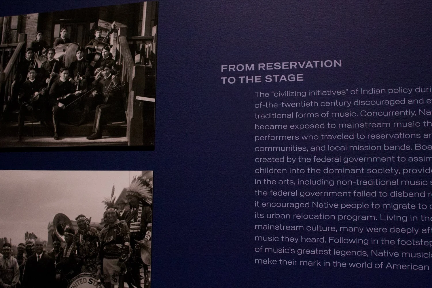
Creating graphics for an exhibition about music can be challenging when there are not a lot of physical objects to display. The Smithsonian Institution requested something bold and colorful to represent this show about Native American musicians at the National Museum of the American Indian in New York. The exhibition’s title, “Up Where We Belong,” a lyric and song title by the famed musician and performance artist, Buffy St. Marie, immediately inspired the idea of custom lettering that floated like clouds.
To separate the 13 sections by artist, we filled the walls with large hand-lettered initials of each artist’s first name. In addition to these large callout letters, the sections were set apart by oversized graphic lines that were detailed edges of the cloud-like letterforms. This kept the organic motion of the walls flowing like the music that radiated from the speakers. The dramatic lettering was complemented with the use of our sans-serif font, General, for the exhibition’s subtitle, wall text and labels.